Click the image below to go to the dashboard. A little narrative is provided below.

It is often assumed that low-income populations have worse health outcomes. This is correct for many health outcomes, but for one, it isn’t as clear: Body Mass Index (BMI). BMI doesn’t show a clear association with income. Given that we are in the midst of an obesity epidemic, and BMI is the primary measurement of obesity, this is quite interesting. I wanted to take a look at some recent data to visualize the association.
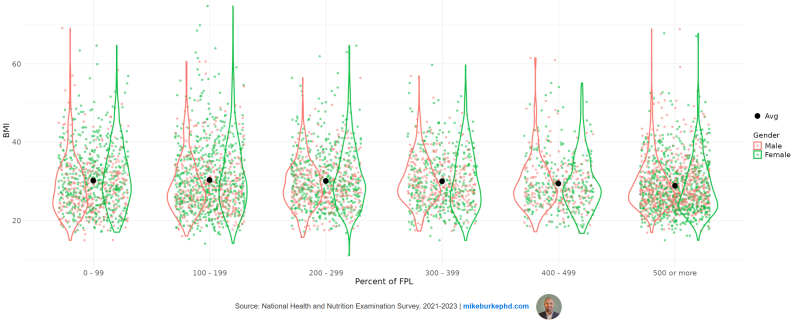
I created a modified violin plot using the 2021-2023 wave of NHANES.
Violin plots are great for getting a sense of the distribution of a variable while also looking at the density of the most likely values. In this example, each dot is a person’s BMI. The black dot in the middle of each plot is the average overall BMI (e.g., not by gender).
Percent of the Federal Poverty Level (FPL) is a measure of income relative to the the official government poverty level. If a households has an income of 50% of the FPL, then their income is 50% less than the poverty level. If their income is 150% of the FPL, their income is 50% greater than the poverty level.
It is clear there is little difference in the distribution and average BMI score by FPL category. The exception is for households with incomes 500 percent or more of the FPL. In that group, we see the average drops slightly and there are fewer individuals with extreme values of BMI and more with BMIs below 30 (see how the violin plot is wider around a BMI of 25, indicating a higher density of values there).
Here is a table with some overall summary statistics:
| Percent of FPL | Mean | SD | Median | Minimum | Max |
| 0-99 | 30.2 | 8 | 29.1 | 14.9 | 69.1 |
| 100-199 | 30.4 | 8.5 | 28.8 | 14.1 | 74.8 |
| 200-299 | 30.1 | 7.2 | 29.0 | 11.1 | 64.7 |
| 300-399 | 30.1 | 6.9 | 28.9 | 14.9 | 59.7 |
| 400-499 | 29.5 | 6.9 | 28.1 | 16.7 | 61.5 |
| 500+ | 28.8 | 6.7 | 27.4 | 14.9 | 68.9 |
Overall, I think this is a neat and easy way to visualize a continuous variable by levels of a categorical variable. A few notes on the analysis:
- This is the unweighted data, so it isn’t nationally representative, but the mean BMIs are quite close to weighted estimates.
- NHANES top-codes age at 80, so anyone 80+ gets coded as 80. For that reason and because there weren’t many observations for those 80+, I only included those aged 18-79.
- Height and weight are measured directly in NHANES, which means reported BMI is accurate (compared to self-reported height and weight).
- Income is self-reported and is top-coded at 500 percent of the FPL. I chose to keep these observations because there are a lot of them and they are an important category of FPL.